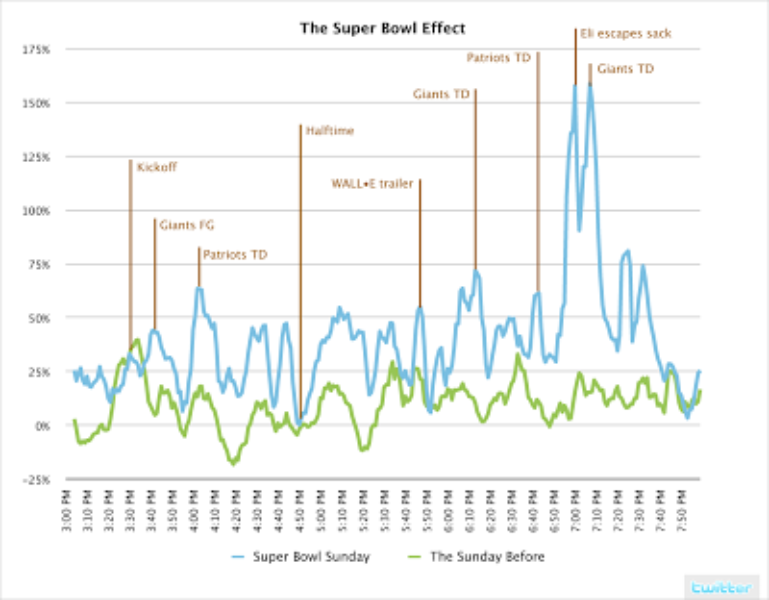
 Click image to see bigger graph
As expected, Super Bowl Sunday was an active day on Twitter. We thought we’d share some info about the day. This graph shows the percentage of updates per minute during the big game normalized to the average number of updates per minute during the rest of the day.
The blue line represents updates during the Super Bowl and the green line represents updates during the same time the Sunday before. The updates per minute are smoothed to 5 minute rolling averages and we’ve annotated the spikes so you can see what people were Twittering about. It’s fun to see the real-time nature of Twitter updates during the shared event.
Did someone say … cookies?
X and its partners use cookies to provide you with a better, safer and
faster service and to support our business. Some cookies are necessary to use
our services, improve our services, and make sure they work properly.
Show more about your choices.