Funnel analysis is a concept that has been around for a while and there are many systems that support counting funnels, or sequences of events. In this post, we describe our experimental visual analytics approach that not only counts the specified sequence, but also aggregates and visualizes information between steps within the sequences to provide broader perspectives. This novel approach helps us learn how users interact with the user interfaces during Tweeting and signing up, and leads to insights for improving user engagement with Twitter.
The challenges of funnel analysis
We’re constantly analyzing user interaction logs to ensure we are delivering product features that users find truly useful and engaging. The simplest way to analyze logs is to count a single log event, such as the Click on Tweet button. However, such click only opens the Tweet composer and does not necessarily mean the user successfully Tweeted. Counting funnels can provide a broader picture. For example, to check how often users abandon a Tweet after they start composing, we can count the funnels “Click on Tweet button then Send Tweet” and compare it with the number of Click on Tweet button. Seeing the composing success rate leads to more exploratory questions such as “is abandonment consistently associated with certain composing activities such as typing or attaching images?”, which tend to push the limits of the ad-hoc counting approach. One workaround is to count all funnels with this template:
Click on Tweet button => ? => NOT Send Tweet
The placeholder “?” is replaced with events of interest such as Enter text and Attach image, leading to two funnels to be counted. As the question gets more complicated, the number of funnels to count starts to skyrocket, multiplying by the number of events of interest every time we add in another placeholder. For example, a template with two placeholders “Click on Tweet button => ? => Attach image => ? => Send Tweet” leads to four funnels. More ambiguous question such as “what are the common sequences of actions before Click on the Tweet button?” will require a variable number of placeholder and quickly become difficult to enumerate. Once all the counts are computed, a data scientist also has to process these counts for interpretations.
The scale of Twitter data complicates the problem even more. To give you some ideas, there are more than 10K types of events and hundreds of millions of users. Sequences with five user activities have 10K^5 possible patterns and these raw data will not fit on any laptop.
Nevertheless, these challenging tasks are beneficial to our understanding of user behaviors. Therefore, we decided to tackle this problem and develop a better solution. In this post, we will tell you about Flying Sessions [1], our experimental visual analytics tool for funnel analysis.
Our approach
We will explain our approach by walking through a fictional use case describing how Piper, a data scientist, analyzes how users find people on Twitter to Tickle, a new fictional feature. Note that all numbers in this post are made up for demonstration and do not reflect actual Twitter usage. To start the analysis, Piper needs to run a data analysis job with two parameters below:
1) Alignment point(s): At least one or more alignment points are required. This is similar to specifying an event or a sequence of events for counting. Piper wants to focus on the users who find people to tickle by opening the “Find people” page, so she defines her alignment points as:
Open ‘Find people’ page => Tickle
The key benefit of our approach is that we not only provide the count for the funnel above, but also aggregate information between the steps and before/after the funnel to provide more context. The contextual information can be from the alignment points themselves, such as time between Open ‘Find people’ page and Tickle, or from other events that are not the alignment points. The second parameter is needed for this purpose.
2) Events of interest: In addition to the alignment points, Piper can include more events to provide more context. These can be events that are relevant to Twitter users’ tickling behaviors such as View profile popup or Open profile page. An event can also be defined as a combination of multiple raw events. For example, Retweet, Like and Reply can be combined and treated as a custom event Tweet engagement.

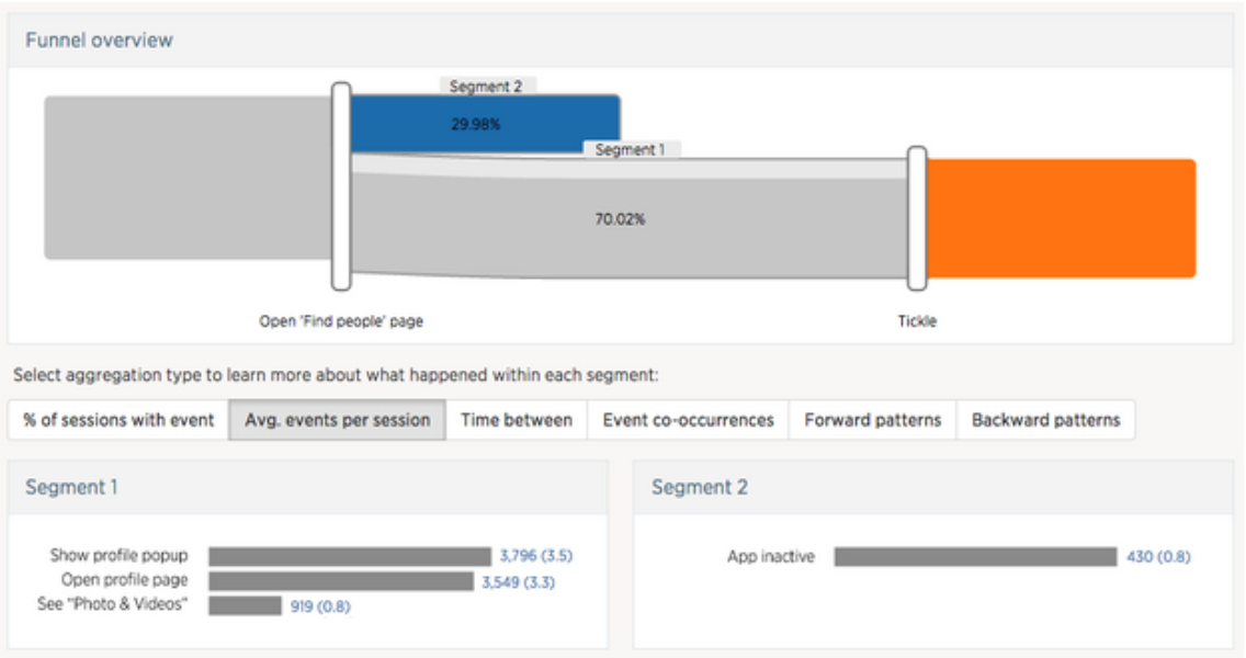
Figure 1. Funnel view with alignment points Open ‘Find people’ page => Tickle. The visualization shows that 70.02% of users tickled another user after opening the “Find people” page.
After the data processing job with specified parameters above is completed, the results can be explored via the user interface shown in Figure 1. The funnel view shows how user sessions bifurcate after each alignment point. Looking at this view, Piper can tell at a glance that 70.02% of the users tickled at least one person after opening the “Find people” page. The regions behind the number 70.02% show that the majority of users have done another action (darker gray region) during these two steps while a small proportion have done nothing else (light gray region).
To get a sense of what users do after landing on the “Find people” page and before tickling someone, Piper clicks on the segment (entire gray region) between the two alignment points. This brings up additional segment information in the bottom panel (Segment 1), which Piper can choose from different types of aggregated information.
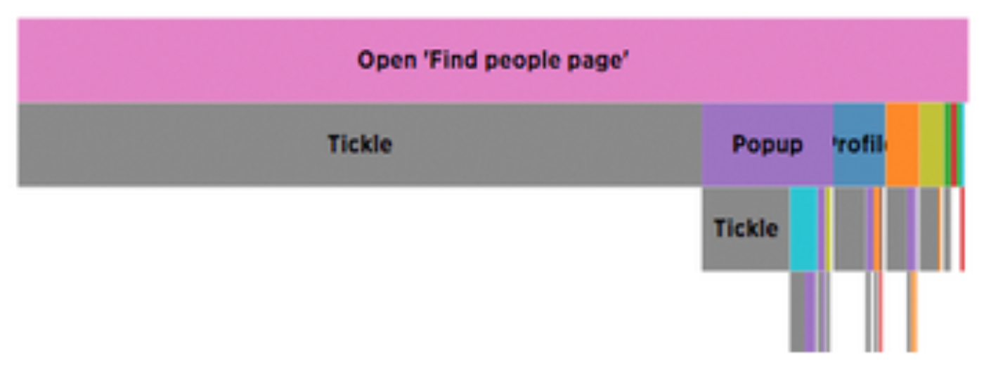
Piper chooses the “Average count per session” view, which shows the most frequently performed actions in this segment and their average counts. Piper notices that users on average look at the profile popups of recommended users 3.5 times before deciding to tickle. It also seems common for users to look at the profile page and the photo and videos tab. Piper switches to “Forward patterns” view (so the bar chart in Figure 1 is replaced with this visualization below in Figure 2) and sees that many users tickle immediately while many open the popup before tickle.

Figure 2. Visualization of common patterns between alignment points, which can be read from top to bottom. Each rectangle encodes an event and its width is proportional to the number of sessions. For example 100% of the patterns start with Open ‘Find people’ page (pink) and 70% of the time are followed by Tickle (gray) immediately.
Piper can also select another segment (blue region in Figure 1) that represents users who did not tickle to compare side-by-side (Segment 2). This feature is usually useful for comparing users who are in the funnel and users who dropped out to spot different behaviors. In this case, none of the users who dropped out tried to preview the user profile or visit profile page.
Iterative analysis
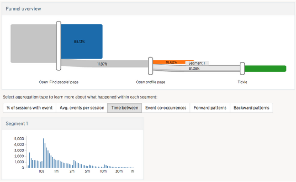
Flying Sessions was designed to encourage iterative analysis, where the data scientist gradually modifies the set of alignment points to accommodate newly emerged analysis questions. Seeing that users frequently look at target users’ profile pages before tickling, Piper decides to look more into this and adds “Open profile page” as a new alignment point:
Open ‘Find people’ page => Open profile page => Tickle
She then clicks on the segment between Open profile page and Tickle and chooses the “Time between” option in the aggregate view. She notes that the majority of the users spend around ten seconds scanning the profile of a user they might want to tickle.

Figure 3. The new results after adding more alignment point Open profile page
How does it work?
We use Scalding to filter and summarize raw log events in Hadoop, which is often on the order of GBs or TBs, into a much smaller JSON file (a few MBs) that can be visualized in a web-based front-end, built with D3 and d3Kit. The data pipeline consists of three major steps: sessionization, segmentation, and aggregation.
Sessionization
Events are sorted by timestamp and grouped by user ID, then added into a session in order until the time difference between two consecutive events is more than 30 minutes, at which point a new session is created. In other words, each session contains consecutive events that belong to a single user and does not contain any period of inactivity that is longer than 30 minutes.

Figure 4. During sessionization, events that are more than 30 minutes apart are split into separate sessions.
Segmentation
The segmentation stage extracts subsequences of events relevant to the analyst-specified alignment points from sessions, and groups the subsequences into segments based on the alignment points they contain. This stage contains two steps:
Step 1: identify session fragments — A set of alignment points may appear multiple times throughout a session, and ideally we want to capture all those occurrences. Therefore, we first identify session fragments from sessions, in which each alignment point occurs at most once. To do so, we find all occurrences of the first alignment point. For each occurrence, we apply a window which extends in both backward and forward directions and is cut off at the neighboring occurrences of the first alignment points or session boundaries. All events covered by the window form a session fragment.

Figure 5. A new session fragment is identified with every occurrence of the initial alignment point (Find people).
We then identify the other alignment points contained in each session fragment. To find those alignment points, we scan forward from the initial alignment point, looking for the second alignment point. Once the second alignment point is found, we continue the forward scan but this time looking for the third alignment point. We repeat this process until all alignment points have been identified or the end of the session fragment is reached.
Step 2: extract and group subsequences between alignment points — We then iterate through all the session fragments, extracting subsequences between each pair of neighboring alignment points. Each subsequence is labeled with two properties: the number of alignment points matched by the corresponding session fragment and the indices of surrounding alignment points. Finally, we group subsequences with the same labels into same segment.

Figure 6. From each session fragment, we extract and group subsequences of events that come between each pair of neighboring alignment points (Find people and Tickle). Eight subsequences shown above are grouped into four segments. Subsequences from fragment 1 and 2 are not grouped with fragment 3 and 4 because the latter fragments contain only one alignment point (Find people) while the former contains both (Find people and Tickle).
Aggregation
The aggregation stage pipes the segments from the previous stage through a variety of aggregators in parallel to produce summaries (e.g., average count of events) that can be visualized in the front end. This stage is highly extensible. New aggregators can be added when demands for new types of summaries arise.
Conclusions and future work
Flying Sessions was designed to support funnel exploration with less required effort and provide more information than simple counting. The project is still in early stages and we envision a few design improvements that will enable more flexible analysis, for example, to extend support for optional alignment points. We also include only a modest set of aggregation methods, but it’s possible to add new types of aggregation that employ pattern mining or more sophisticated algorithms. The segments are also just sequences of events and can be exported for other purposes or recursively analyzed.
Acknowledgement
The main contributor of this project was Hua Guo, a PhD student at Brown University, who worked with Krist during her summer internship at Twitter HQ. She also co-wrote this blog post.
We appreciate the help and feedback from Gillian Chin, Charlie Croom, Jesse Bridgewater, Joy Ding, Nodira Khoussainova, Joshua Lande, Raghav Ramesh, Dmitriy Ryaboy, and Richard Whitcomb during the development of Flying Sessions.
Footnote
[1] Flying Sessions mentioned in this blog post is actually the second version. The earlier version [2], only supported single alignment point and focused on identifying common patterns. These eventually became the aggregated views: forward patterns and backward patterns (Figure 2).
[2] Krist Wongsuphasawat and Jimmy Lin. Using Visualizations to Monitor Changes and Harvest Insights from a Global-Scale Logging Infrastructure at Twitter. in Proc. IEEE Conference on Visual Analytics Science and Technology (VAST), pages 113-122, Nov 2014.
[3] George Lee, Jimmy Lin, Chuang Liu, Andrew Lorek, and Dmitriy Ryaboy. The Unified Logging Infrastructure for Data Analytics at Twitter. in Proc. International Conference on Very Large Data Bases (VLDB), pages 1771-1780, Aug 2012.
Did someone say … cookies?
X and its partners use cookies to provide you with a better, safer and
faster service and to support our business. Some cookies are necessary to use
our services, improve our services, and make sure they work properly.
Show more about your choices.