Events cause people to synchronize and act together. When something dramatic happens on TV, with a favorite sports team, or outside our own windows, people come together on Twitter.
We can use billions of public Tweets to detect events and visualize the synchrony they generate at a large scale.
My colleague Jimmy Lin (@lintool) and I recently published a research paper looking at three causes of synchrony around the globe: natural, routine and cultural.
Natural synchrony
The first visualization shows Tweets about “sunset” in different parts of the world. The horizontal axis is day of year in 2012 and the vertical axis is local time of day. Color represents the volume of Tweets sent during that day, at that time.
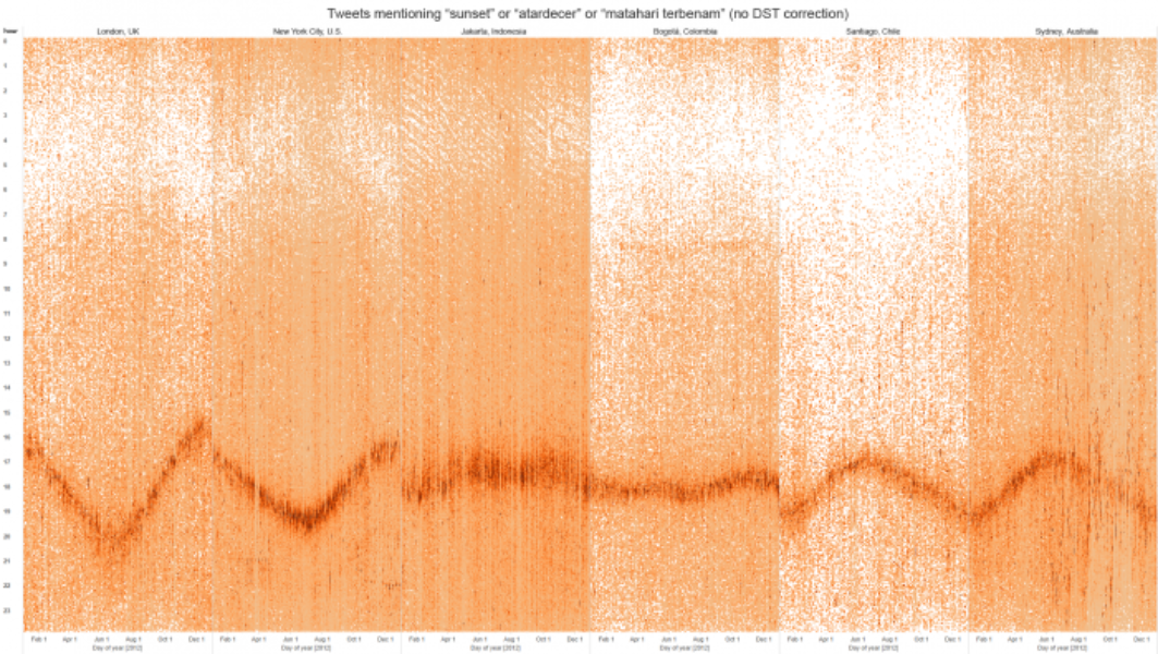
Obviously, Tweets about sunsets spike when there’s a sunset. We can use this pattern of Tweets to visualize how the time when the sun sets differs by season, as well as to compare how these lines of activity in 2012 differ among cities below the equator (e.g., Santiago, Chile; Sydney, Australia), closer to the equator (e.g., Jakarta, Indonesia; Bogotá, Colombia) and above the equator (e.g., New York City or London).
Another way to look at this is by visualizing the number of Tweets according to the time they were posted (i.e., a “time series”). The color in our time series represents the month in 2012 when the Tweets were posted. See how, closer to the equator, the Tweets concentrate more in one specific time, while Tweets in cities above and below the equator are spread from 4 to 9 p.m., depending on the month of the year when they were posted.

Routine synchrony
In the second example, let’s look at Tweets mentioning “good morning” to understand how cities around the world wake up. Using the same heat map visualization, we can clearly see patterns emerge across cities, as well as patterns that differentiate these cities.
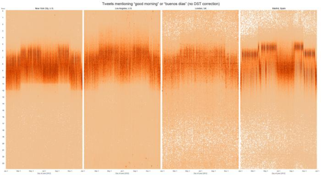
The most visible pattern across all of the heat maps is the shift in time for “good morning” Tweets when daylight savings time goes into effect. The second pattern, most visible in Madrid and least visible in London, is summertime –– when “good morning” Tweets shift to a later time and then back to their usual time after summer ends.
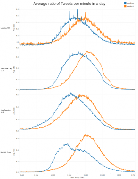
There are also noteworthy differences across these heat maps. New York City, for instance, shows a sudden drop on “good morning” Tweets right at noon, while London shows spikes on the hour throughout the morning. Madrid shows the most pronounced contrast between times in weekdays and weekends when users tweet “good morning” or “buenos días”. This can be seen more clearly below in a chart of Tweets per minute between 1 a.m. and 3 p.m. over a weekday vs. weekend.
Cultural synchrony
What does a year of tweeting look like in different parts of the world? Let’s move away from particular keywords and focus now on the big picture in two cities with the most visible contrast in activity: New York City and Riyadh, Saudi Arabia.
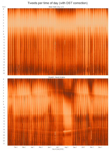
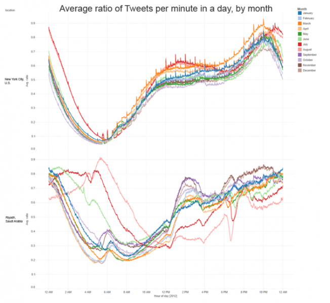
Observe the differences in daily activity between these two cities. Notice the patterns — specifically in Riyadh — how the sunrise and sunset lines are visible as a drop in activity, which is very pronounced during Ramadan. In New York City, the heat map shows a very stable pattern of usage that only changes during summer, when users tweet later at night. These patterns are more visible by looking at a time series of a day (by month), which you can see below.
These examples aren’t new or noteworthy on their own, of course; we already understand these events. What is remarkable is that we can observe these phenomena just by analyzing Tweets from people around the world –– a method that can teach us more over time about humanity, countries and their cultures.
Did someone say … cookies?
X and its partners use cookies to provide you with a better, safer and
faster service and to support our business. Some cookies are necessary to use
our services, improve our services, and make sure they work properly.
Show more about your choices.